This document presents a very basic example you can access to Census and other data. and use them to provide context for local evaluation data. Specifically, this tutorial uses the R programming language, and includes examples and the R code you need (click the “Code” buttons below) to get you started.
So, let’s start with some sites – fictional in this case! We might have
three groups that receive training in ethics. We will make some bogus
data by simply “assigning” names and values to variables called
SiteName, Enrollment, PctGoals, and then a location with latitude
and longitude. You can copy and paste the code directly into R.
SiteName<-c("Amazing Workers","Better Accountants","Cheating Luddites")
Enrollment<-c(344,411,388)
PctGoals<-c(70,80,90)
lon<-c(-76.081,-76.015,-76.0157);lat<-c(40.99,40.93,41.1731)
df<-as.data.frame(cbind(SiteName,Enrollment,PctGoals,lat,lon))
df$lat<-as.numeric(df$lat);df$lon<-as.numeric(df$lon)
df
##             SiteName Enrollment PctGoals     lat      lon
## 1    Amazing Workers        344       70 40.9900 -76.0810
## 2 Better Accountants        411       80 40.9300 -76.0150
## 3  Cheating Luddites        388       90 41.1731 -76.0157
Above, we can see that one of the groups, the “Cheating Luddites” have the highest percentage of training goals completed (and we have some location data too).
Let’s imagine the evaluation team wants to put their sites into greater community context. So, why not use information about poverty and education? Gosh, that makes so much sense!
Get Poverty Data
The tidycensus package enables you to grab ACS or Decennial Census
data and download it directly to R. In this example, I grabbed
tract-level population data, and the number of individuals under 18
years of age in poverty, and then calculated a percentage. You can see
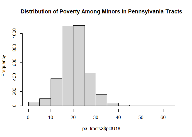
the distribution of the percentages in the histogram below.
More info on the tidycensus package is here. NOTE that you will need to create an API key (easy to do).
library(tidycensus)
#mycensusapikey<-"replace with yours"  # uncomment this line and the next one when you run this code
#census_api_key(mycensusapikey,install = TRUE)

tractPopulation<-get_acs(
  geography = 'tract',     # select tract level data for Pennsylvania in 2020
  state = 'PA',year=2020,
  variables = "S1701_C01_001E") # Est of number people for whom pov is determined

tract18under<-get_acs(
  geography = 'tract',
  state = 'PA',year=2020,
                 variables = "S1701_C01_002E") # Est of those aged under 18 years of age
tract18under<-tract18under %>% select(estimate) %>% rename(estimate18=estimate)

pa_tracts2<-cbind(tractPopulation,tract18under) # put the two variables into one dataframe
pa_tracts2$pctU18<-(pa_tracts2$estimate18/pa_tracts2$estimate)*100
So far, we downloaded data and computed a new variable tract18under
Now let’s plot these data!
# make a basic histogram
hist(pa_tracts2$pctU18,main="Distribution of Poverty Among Minors in Pennsylvania Tracts")

Get Education Data
Using the educationdata package from the Urban Institute, I downloaded
NCES enrollment data for Wilkes-Barre Area School District. To identify
the LEAs you want, you’ll need to know the NCES codes that are
here.
More info on the educationdata package
is
here.
library(educationdata)
pa <- get_education_data(
  level = 'schools',   # select school level data
  source = 'ccd',
  topic = 'enrollment',    # download enrollment related data
  subtopic = list('sex'),   # download enrollment details by sex
  filters = list(
  year = 2019,
  leaid = c('4226300')),    # choose one LEA (or more if you wish); you'll get all schools in the LEA
  add_labels = TRUE)
Let’s take a look at what we downloaded! We can use a simple table to display the enrollment categories:
table(pa$grade)
##
##           Pre-K    Kindergarten               1               2               3
##               0              20              20              20              20
##               4               5               6               7               8
##              20              20              20              12              12
##               9              10              11              12              13
##              16              16              16              16               0
## Adult education        Ungraded           Total   Not specified
##               0               0              40               0
The very messy output shows there are 20 first grade records, 16 ninth
grade records, etc… There are also 40 records that provide a “total”
enrollment, and that’s what we want. Below we will “keep” only those
records. (see expss package for nicer HTML tables)
pa<-pa[pa$grade=="Total",] # this is subsetting the file to records where grade is equal to "Total"
direc <- get_education_data(
  level = 'schools',
  source = 'ccd',
  topic = 'directory',
  filters = list(
  leaid = c('4226300')), # directory of schools for one LEA
  add_labels = TRUE)

direc<-direc%>%
  group_by(ncessch)%>%   # we need to aggregate by the school code
  summarise(school_name=first(school_name))  # compute the first school name, so we get one record per school

pa2<-left_join(pa,direc,by="ncessch")  # merge schools data to directory information (e.g. school names)

# create a simple table of mean enrollment (see expss package for more refined tables)
pa2 %>%
  group_by(school_name) %>%
  summarise(enrollMEAN=first(enrollment))
## # A tibble: 10 × 2
##    school_name                       enrollMEAN
##    <chr>                                  <int>
##  1 DANIEL J FLOOD EL SCH                    699
##  2 DODSON EL SCH                            568
##  3 DR DAVID W KISTLER EL S                  987
##  4 ELMER L MEYERS JSHS                      890
##  5 G A R MEMORIAL JSHS                      934
##  6 HEIGHTS EL (MURRY COMP)                  879
##  7 JAMES M COUGHLIN JSHS                    898
##  8 SOLOMON EL SCH                           848
##  9 SOLOMON JHS                              486
## 10 Wilkes-Barre Area SD STEM Academy         60
Looks like Kistler Elementary School has the highest enrollment. Amazing.
Create Program Area Map
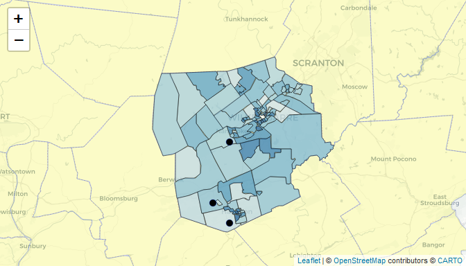
Let’s use the Census and NCES data to place the evaluation sites into context using a map.
Shapefiles are datasets that define physical boundaries or positions of different features (e.g. schools, crime, rainfall). Many shapefiles are available from the Census Bureau. The following steps (1) download the shapefiles, (2) merge our contextual data to them, and (3) create a map.
library(tigris);library(leaflet)

pa_t<-tigris::tracts(                   # this command says you want a tract shapefile
  state = 'PA',county = "079",  # download Luzerne County and assign it as `pa_t`
  progress_bar=TRUE)
pa_t2<-merge(pa_t,pa_tracts2,by='GEOID')  # merge datasets using a common variable

pa_c<-tigris::counties(state = 'PA',progress_bar=FALSE)  # download PA counties

palTract<-colorNumeric(palette = 'Blues',domain = pa_t2$pctU18)  # make a set of colors that align with the map

m<-leaflet(df) %>%
    addProviderTiles("CartoDB.Positron") %>%    # background tiles
    addPolygons(data=pa_c,fillColor = 'yellow',fillOpacity = .2, weight=.4) %>%    # counties
  addPolygons(    # Census tracts
        data=pa_t2,
        weight=1,color='black',stroke = T,  # boundary line properties
        fillColor =~palTract(pa_t2$pctU18), fillOpacity = .7,
        label=paste0("Tract #:",pa_t2$GEOID)
        ) %>%
    addCircleMarkers(weight=.5,radius=5,fillColor='black',fillOpacity = 1, label=df$SiteName) %>%
    setView(-76,41.2,zoom=9)

m
