First, wear your mask. OK? With that, the rest of this post is an exploratory analysis to satisfy my curiousity.
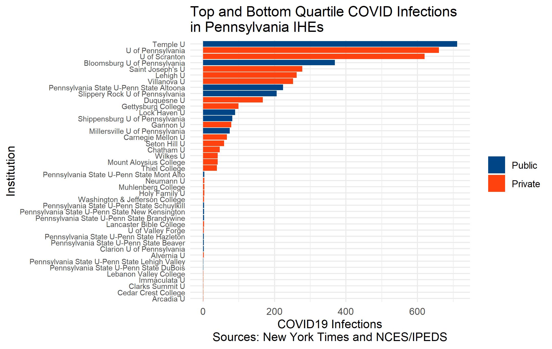
There is a wide range of enrollments and COVID cases in Pennsylvania higher ed. First, let’s look at the count of COVID cases. The plot below shows the institutions with the lowest and highest number of cases. The mean number of infections is 64.5 and the median is 18.00.
Of course, we need to think of the rates of COVID per enrollment, and that’s what the scatterplot does for us. The mean infection rate is 0.011 and the standard deviation is .016.
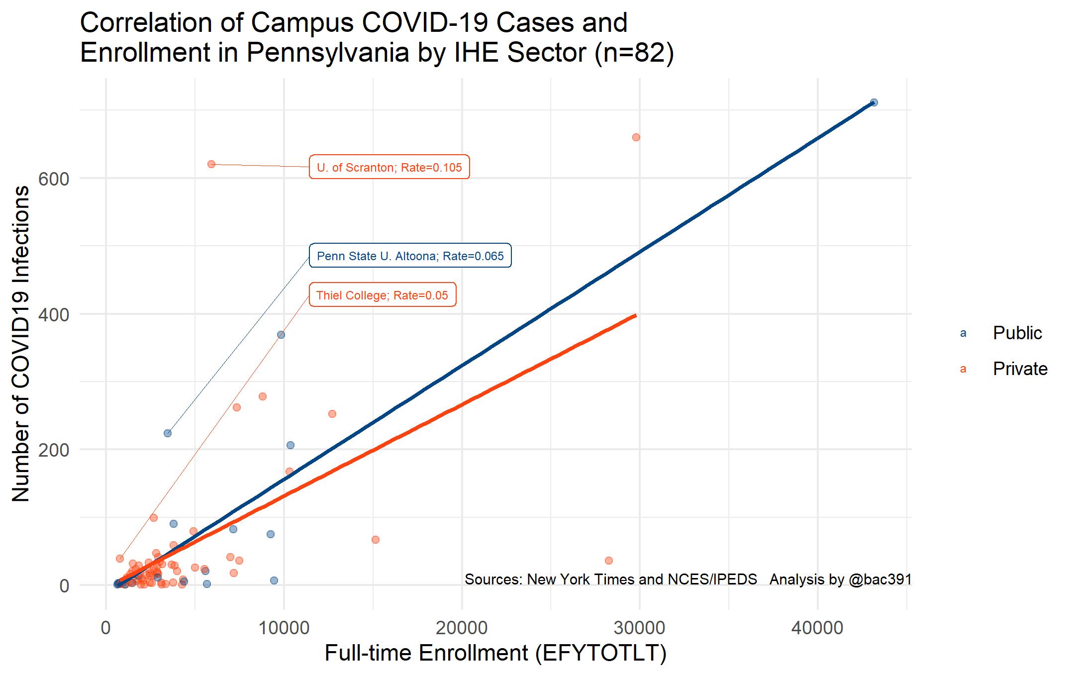
Then we’ve got some outliers to consider. Removing the highest enrollment and highest COVID case records we get a plot that’s dialed-in a little more:
\
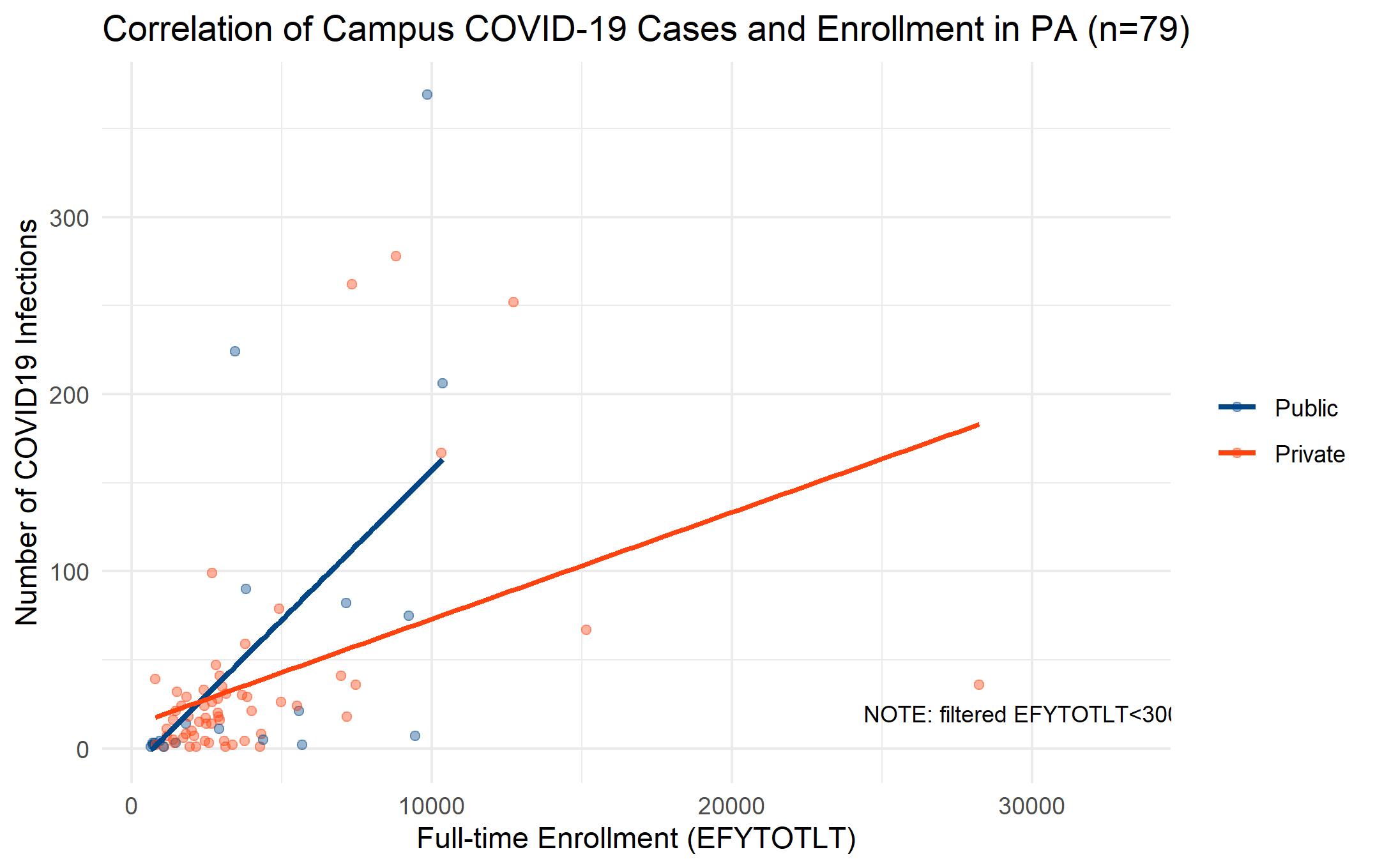
Using this trimmed file (n=79), let’s use a basic regression to see if the relationship is statistically significant:
| Coefficients: | |||||
|---|---|---|---|---|---|
| Estimate | Std. Error | t value | Pr(>|t|) | ||
| (Intercept) | 12.867842 | 11.093188 | 1.16 | 0.24974 | |
| EFYTOTLT | 0.006025 | 0.001914 | 3.147 | 0.00237 | ** |
| SECTOR2 | -24.6687 | 24.185081 | -1.02 | 0.31101 | |
| EFYTOTLT:SECTOR2 | 0.010864 | 0.004501 | 2.414 | 0.01823 | * |
Multiple R-squared: 0.2758, Adjusted R-squared: 0.2468 F-statistic: 9.52 on 3 and 75 DF
Enrollment, not surprisingly has a role to play on infections, and without the outliers, there is an interaction between sector and enrollment.
So, with all that, why might public schools be at a disadvantage at keeping COVID rates lower? Or, if we add more states to these data, perhaps this pattern does not hold up. I don’t know if I’ll ever get back to these questions, but IPEDS data have plenty of variables for additional exploratory analysis if time warrants.
library(RCurl); library(dplyr);library(ggplot2);library(stringr)

x<-getURL("https://raw.githubusercontent.com/bac3917/Cauldron/master/covidIHE.csv")
x<-read.csv(text=x)
x$infectionsPerEnroll<-round((x$infections/x$EFYTOTLT),digits=3)
x$SECTOR<-factor(x$SECTOR,levels=c(1,2),labels=c("Public","Private"))

#shorten names
x$inst<-str_replace(x$inst,"University","U.")
x$inst<-str_replace(x$inst,"Pennsylvania","Penna.")

# PLOT 1
x$INSTNM2<-str_replace(x$INSTNM,"University","U")
x2<-x %>% filter(infectionsPerEnroll>.084 | infectionsPerEnroll<.019)
p1<-ggplot(x2, aes(reorder(INSTNM2, infectionsPerEnroll),infectionsPerEnroll,fill=factor(SECTOR)))+
  geom_bar(stat="identity")+ylab("COVID19 Infections per FT Enrollment\nSources: New York Times and NCES/IPEDS")+
  scale_fill_calc()+xlab("Institution")+
  theme_minimal()+
  theme(legend.title = element_blank(),
        axis.text.y = element_text(size=7))+
  coord_flip()+ggtitle("Top and Bottom Quartile COVID Infection Rates \nin Pennsylvania IHEs")
p1
#PLOT 2 -
library(ggrepel)
x$label1<-ifelse(x$infectionsPerEnroll>.042,paste0(x$inst,"; Rate=",x$infectionsPerEnroll),NA)
summary(x$infectionsPerEnroll)

# All labels should be to the right of 3.
x_limits <- c(11000, NA)
y_limits <- c(400, NA)


p2<-ggplot(x, aes(EFYTOTLT,infections,color=SECTOR))+
  geom_point(alpha=.4)+geom_smooth(se=FALSE,method="lm")+
  ylab("Number of COVID19 Infections")+
  xlab("Full-time Enrollment (EFYTOTLT)")+
  scale_color_calc()+
  geom_label_repel(data=x,label=x$label1,size=2,
                   segment.size = .2,direction = "y",
                   xlim = x_limits, ylim = y_limits)+ # put labels in specific area
  theme_minimal()+
  #annotate(geom="text",x=25000,y=200,label="Names shown for schools with \nrates greater 2SDs over mean.",
  #           hjust=0, size=3)+
  annotate(geom="text",x=33000,y=10, label="Sources: New York Times and NCES/IPEDS   Analysis by @bac3917",size=2.5)+
  theme(legend.title = element_blank(),
        axis.title.x =  element_text(size=11))+
  #  facet_wrap(~SECTOR)+
  ggtitle("Correlation of Campus COVID-19 Cases and \nEnrollment in Pennsylvania by IHE Sector")
p2
# Remove outliers
x3<-x %>% filter(EFYTOTLT<30000 & infections<400) # toss these bad boys
summary(x3$infectionsPerEnroll)
p3<-ggplot(x3, aes(EFYTOTLT,infections,color=SECTOR))+
  geom_point(alpha=.4)+geom_smooth(se=FALSE,method="lm")+
  ylab("Number of COVID19 Infections")+
  xlab("Full-time Enrollment (EFYTOTLT)")+
  scale_color_calc()+
  theme_minimal()+
  annotate(geom="text",x=33000,y=20, label="NOTE: filtered EFYTOTLT<30000 & infections<400",size=3)+
  theme(legend.title = element_blank(),
        axis.title.x =  element_text(size=11))+
  #  facet_wrap(~SECTOR)+
  ggtitle(paste0("Correlation of Campus COVID-19 Cases and Enrollment in PA (n=",dim(x3)[1],")"))
p3

t<-summary(lm(infections~EFYTOTLT,data=x3))
library(pander)
pander(t)